
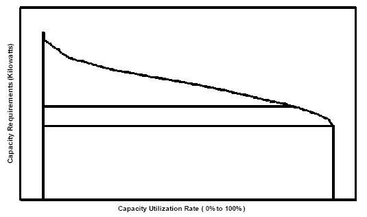
There’s a chart you’ve never heard of that perfectly represents how inefficient the power grid is and how much we need more distributed energy solutions. Agencies responsible for the reliability of the grid, including the California System Independent System Operator CAISO, use what are called Load Duration Curves, or LDCs, to plan investments and monitor efficiency. The area under the LDC see image below represents the energy demanded by the system and the curve illustrates the relationship between energy use and generating capacity needs.
via The most important chart in energy — Tech News and Analysis.
Categories: Electricity, Energy
